Wednesday, December 31, 2014

Gotta Learn to Go Limp - LOO$EY GOO$EY

Shake. It. All. Up. Song stuck in my head (ahem).

Time and attention. If 'time' is currency, then 'attention' is the transaction. What use is extra time if you aren't spending it wisely? Am I paying attention  to the things that accrue the most interest for my end goal? I'm always assessing/reassessing my portfolio, but sometimes it pays to gamble. After doing mostly studies for the past 1.5 yrs (almost halfway through my 4-yr plan) I finally created something just for the hell of it. I can't believe how fast time flew by when I did it. It's something I haven't felt for awhile. More importantly, I was able to spot areas that need more investment and will reallocate as necessary.

1 of 2 pages of warm-up exercises I picked up from Peter Han. You go over your lines, curves, circles, etc. 8x. This is supposed to be done in a sketchbook (where you can actually watch your hand move as opposed to a stylus and Wacom tablet where your eyes are on the screen) and improves hand dexterity, also. When I did studies afterward the strokes DID feel more fluid.
I didn't get to all 5 basic shapes yet, but these were done from renderings in 3DS Max. Lighting in the program is a monster of its own so I was unable to depict bounced lighting. The cube and sphere are of one light set up drawn from different camera angles.

Here is where I felt like breaking free from my standard routine of doing gesture drawings from Croquis Cafe (OnAir video is the Youtube page). I noticed before I'd start a session I would just doodle on my own and this time I just went with it. I like to draw emotion/a story when I mess around so I went with 'The Bench'.
Proko's Anatomy Course is here! Good thing I didn't drop 7 bills on Scott Eaton's. This was a free exercise he gave out so I took a stab at it. Ecorches (or anatomy tracings) are crucial to the understanding of anatomy. Why haven't I done them up until now, you ask? Stagnation? Procrastination? I wanted to wait until I enrolled in Scott Eaton's program so yeah, procrastination.

"In the Land of the Thai the Man with One Eye is King"  But the sun sets on all kingdoms eventually. Some issues with perspective and anatomy; left out a few details; it has that 'Photoshop Look' to it, but I just need to vary my brushes. I only used the standard brush (except for the grass). Fan art is good for drawing on emotion/inspiration as you don't have to pull too much from your life experience to tell a story. The characters are familiar so you sort of role play. Besides, I have another world I devote a lot of myself to. My focus is renewed (getting back into the gym next week!) and January will be spent doing "active recovery" before putting to bed the 2nd year of my self-study.


Thursday, November 13, 2014

Misdirected, But Not Misled

I can't recall everything I wanted to say here, but a recent video I saw by an artist I admire (didn't know it was him until I saw one of his works I recognized) spoke about the importance of painting abstractly in regards to color harmony. It was just what I needed to hear. Color is a dragon that can never be slayed, but I'm damn sure going to take one of its wings as a souvenir. Beleeedat! lol

And god, I see why so many complain about the lost resolution of some of the work they post ...
The source image is warmer so maybe I could've saturated my study more. There was enough contrast in the image for me to spot some of the planes of the face. The next one, though ...

... opposite case here. I warmed her up a bit too much, but I was experimenting (just a little bit) with a color layer.

And I've reintroduced myself to the importance of doodling. Time super flies when I just draw aimlessly. I like that. Perspective and a few more issues with anatomy need to be addressed, as well as value. I'll finally be tackling those this week by cracking open a few Digital Tutors videos about modeling and lighting in 3DS Max. I miss Max. I'll render some primitives (what a deity says before creating people) in basic lighting setups and draw from them.

Tuesday, October 21, 2014

Color Me Glad

SO, I finally decided to get a bit serious about color (I was the weird guy always looking her way and not saying anything to her). I had no idea she'd be so receptive. Chris Legaspi on Youtube had a few interesting videos that helped initiate my first few studies this month: 
The top left two (Puss in Boots and Mountains) were done using Nathan Fowkes' work as reference (as suggested by Mr. Legaspi). The other five were from different artists. Out of frustrated curiousity, I began sampling colors with the eyedropper tool AFTER I would complete a study. I did this to see just exactly which colors were used and to measure how close (or far off) I was in my attempts to match the originals.

I systematized that color picking practice and created value scales based on different parts of the images (hair, parts of skin). Also, since my aim is to become a character artist I opted to use portraits as reference. From the third image on you'll notice a closer likeness to the sources (though likeness wasn't the aim here). This had to do with a video I saw of Jeff Watts (and one video a student of his posted) that recommended using the outline of your subject as a launching point for your drawing. I looked for basic, hard angles first and then refined the curves just a little bit. I was too dependent on the 'head construction' method, which suits creating a head from scratch much better (though you could still incorporate some of the latter's techniques into a portrait study, as you see fit).

Tuesday, September 30, 2014

Derailed at the Last Minute!

So I had planned to end the month with a few short studies tonight, but got caught up helping my niece with a project for school. I chose today to finally write a letter to an old friend thinking I had the evening to myself, but nope! 'Resistance' is at it again. Anyway ...

These are gesture studies based on the Croquis Cafe videos. They start with five 1-min. poses, four 2-min. poses and finish with a 5-min. pose. I'm going through their backlog currently and dread the day I catch up as they only update their videos weekly! I need at least one daily! 270 total.

These were just doodles to break up the gesture studies. Freehand drawing is good for finding out what my weaknesses are: head tilts, humeral-scapular rhythms. I may do a few ecorches. My plan was to start Scott Eaton's Anatomy course, but I can't drop that $700 just yet. It may be for the better. I need to turn my attention to light/shadow and color studies. I've been avoiding them for too long. I'm just so fascinated with human anatomy, though.

The more detailed pieces are longer studies. It's been awhile since I've done a few and I'm itching to knock out a few more. Switching up the types of studies I do fends off burnout, I find. I used a Hard Round Brush at 100% Opacity with 49% Flow. No blending brush and only four values over top a base color. 

Thursday, September 4, 2014

Keeping My Eyes On the Road

Glad summer is coming to an end. I love the sun, but can do without the humidity. Was in a bit of a spin last month. Less dizzy now and upping the study time.

Followed some of Matt Kohr's lessons from Ctrl+Paint. This was a basic color exercise where I combined A and C to get B (B+C=BC, A+B=AB). The goal was to create a value scale that matched each example.

Here, I did the same. I then blended the values to create a gradient. That blue stroke was on the same layer of the file so I said 'eff' it and left it. Up until this, I never was a huge fan of the eyedropper tool. I only used it here to compare my colors to the example - like checking my answers. 

In the video for this exercise he demonstrated a part of his workflow that I'll adopt. 100% Opacity and 45-55% flow settings. His line work is always separate (usually standard practice), but he doesn't limit his layers as far as adding value goes. More importantly, he could care less about staying in the lines. This was the hardest thing for me to let go, but when I did it helped tremendously. It allowed me to make long, flowing strokes. Perfect since I work on a small Wacom Bamboo. After you lay your values down you merge your value layers (if you have more than one) and just erase everything outside of the line work.

I just felt like doing a quick portrait study to break up the lessons. Her ears are elfish. Mouth could use more work. I do portraits a little faster now, mostly because I'm not trying to capture a complete likeness.

I had a sketch layer and line layer for this and the canvas settings for this file are ones I'll stick to for awhile. Just drawing cubes and phones to get more comfortable with the stylus and "see" angles better.

I made sure to fill this up. I was zooming in pretty close. Another of Matt's videos had to do with drawing spoons. This exercise really helped. I tried to limit myself to 1-2 strokes for the spoon line work. A few doodles on the left and lots of gesture drawings from the Croquis Cafe page on Youtube. They have 20 min. life drawing sessions consisting of 1 and 2 minute poses, then a 5 min. pose. So glad to have found that page. I drew three heads to fill in the negative space and am again pleased with the fact that they didn't take me forever to do.

Monday, July 28, 2014

A Musing ... A Muse ...

Sometimes you have to go away to make a comeback. I was in need of some recharging, plus I started a new job. Can't live off of savings forever (yet!). A culling took place over the past few months in which I began to examine and eliminate certain habits, practices and people that were impeding my growth (so long, alcohol ... I see you over there looking withcha looking @$$, vegetarian/veganism). In the end, we're the only ones getting in the way of ourselves.
       I've just entered my "sophomore" year of curated self-study (everything before wasn't well organized) and have my eyes set on Chris Oatley's Magic Box, New Masters Academy, Watts Atelier online courses and Scott Eaton's Anatomy course. I've been yearning to write (arcs and stories for a few game worlds) and create music. It's to the point where the few lucid dreams I had over the past month are entirely sound (music). I also need to organize my game ideas a little better. I have categories/sub-categories, but I jot them down in chronological order. An official Game Design Doc needs to finally come together. My heart feels scattered. Time to rein the wreckage in a bit more and continue building the me I see.

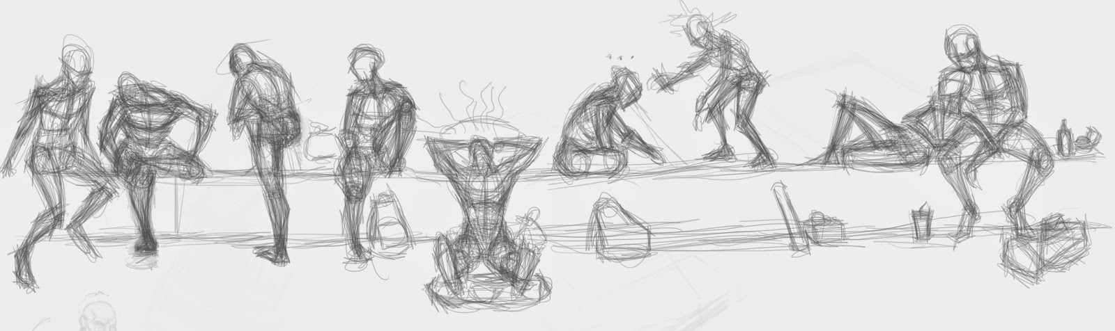
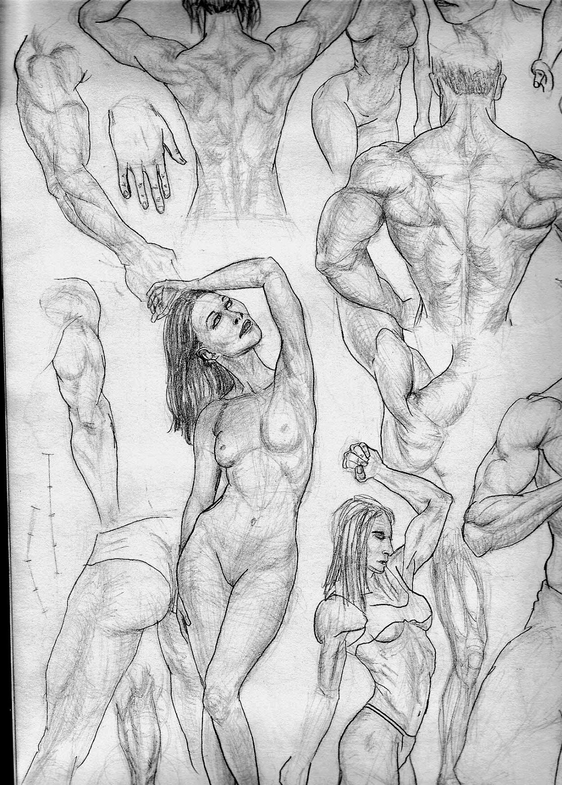
For some reason, images with more than one figure seem a bit easier to make. What sucked was the low resolution of the canvas. When I zoomed in or wanted to blend a bit more it just got pixelated and messy, so ...

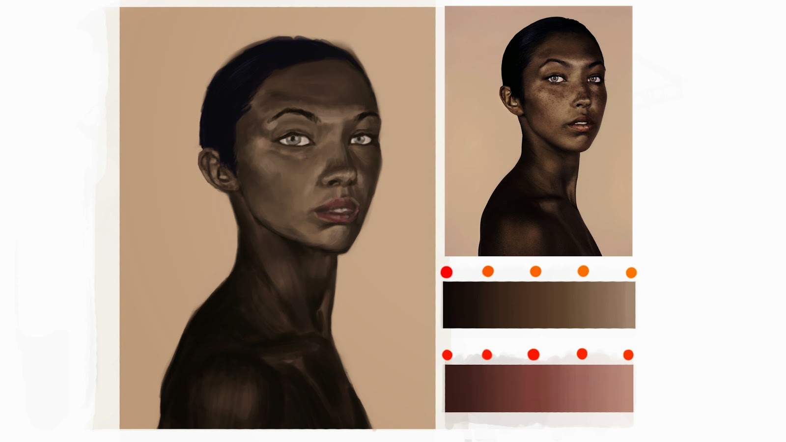
... I made sure to up the PPI (pixels per inch). This one had 1200 PPI, but I had to resize it for the blog. Just some randomness and three female head studies. In my anatomy studies, I didn't cover the muscles of the head. To be remedied soon.


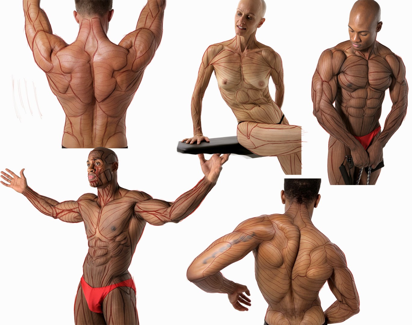
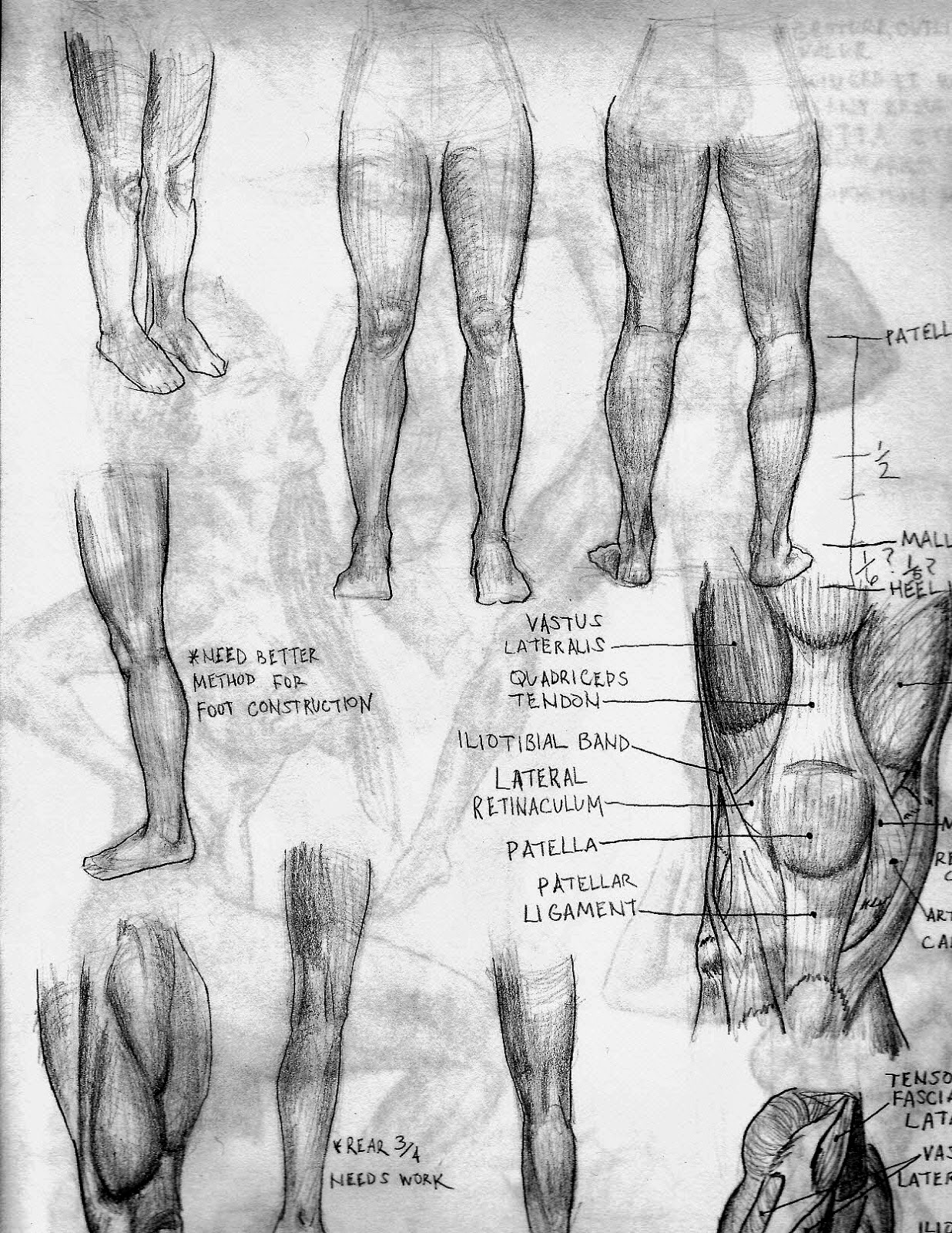
The Tensor Fasciae Latae is hard to observe in a model unless they have really low body fat and somewhat pronounced musculature. Gives me a bit of trouble sometimes. The Gluteus Medius region, also.


Wednesday, April 16, 2014

La Grande Belleza - 35% of Studies from January

That movie didn't hit me until after I watched it. Definitely buying the soundtrack. Watch the movie before you listen to it. And that dive I took into Painter almost drowned me. I'm sticking with what works for me and countless others (Photoshop). My focus went from foundational art skills to trying to get comfortable with new software (Sketchbook Pro and Corel Painter). None of them beat a sketchpad and pencil (yet) ....
Between the end of December and beginning of January I did about 230 gesture drawings. This signaled the end of the first round of anatomy studies I did for the few months prior. Wanted to get back to doing full figures instead of focusing on specific areas of the body.


I hadn't drawn heads for a good while. I think did around 30 in January. I used the head construction method (think it was Loomis' method). Circle, halve it, increase length by 50% (which would give you thirds), etc.


Ballerinas are great reference for figure drawing. Not only are they fit, which is great for observing the dynamics of anatomy in motion, but their poses (or at least the ones captured by the photographer) almost have a sort of built in gesture to them.


Is the flesh/fat around her pec area tucked back and under her arms? Or did I make that part a bit too narrow? Little bit of both. And that guy is just short ... not like I made his head a little too large or something.


Chose images with head tilts because I can't do them well. The bent leg still gets me a little, but I'm much more comfortable now that I know how the femur, patella and tibia (even you little fibula) work together and with the muscles of the leg. 

I just felt like it. Currently going through some Vilppu videos, but stopped halfway through to get back to Photoshop. Went through some basic tutorial vids to get back up to speed and will view a few on brush settings before getting back to figure drawing. I'll check back in in a month or sooner.

Tuesday, March 18, 2014

Took the Dive into Painter X3!


I've been going 'HAM' on Painter X3 the past few days. I only paused the tutorials (Aaron Rutten on Youtube) to experiment on my own with certain things. I stopped altogether this weekend to work on a piece. Seeing as how Painter appeals more to traditional artists I resolved to not use the same techniques I used in Photoshop (building up opacities). I may have been using it the "wrong" way, but the Dry Palette Knife was my best friend when it came to blending.
Everything was on one layer except for the unfocused background  (and wayward strands of hair behind her ear) and her bang. I have to stop forgetting to use more layers. Certain fixes are harder to do on just one (areas around the eyes and the edge of her neck).
Experimenting with all types of brushes and found two I kind of like. Just doodling.


Tuesday, March 4, 2014

Different Strokes ...

Sketchbook Pro 2011 isn't the friendliest digital painting program when it comes to blending and brush strokes. Could be me and my Wacom Bamboo, but the quality of my quick pieces are better in PS. It's probably me, though. May finally dive into Corel Painter this week. Heard good things about it ...
A few studies done over the past few days. Trying to keep the strokes simple.

Sunday, February 23, 2014

Crashed Near the End of January. Emerging From the Wreckage. Eh, Just Another Superhero Origin Story :)

I scanned about 30% of the studies I completed in January. I started with +200 gestures, did around 20 faces and some figure drawings. Before I start cloth I'm going to do value and light/shadow studies. This is an area I don't have much experience in so I'll spend as much time as I need to before moving on to cloth and color.
This is from February and done in Sketchbook Pro 2011 (before the 'Fill Transparent' tool, argh!). Lacking a lot of the functionality of Photoshop, SBP forced me to do things the long way (not being able to make selections and having a pretty useless blend/blur/smudge-type tool).

Custom brushes with low opacities were used by default. I used a pencil brush to outline and the airbrush at different sizes to add light and shadow. I've gotten a much better feel for the pressure sensitivity of my Wacom Bamboo and I'm hoping this translates to me getting the most out of the Intuos' increased sensitivity when I upgrade (later this year, probably).

To get around SBP's lack of a selection tool (like the magic wand), I'd make a new layer and draw an outline of the shape with the base color I was going to use (usually medium gray). I'd fill the space outside of the shape outline with white. The layer under it would be filled with medium gray and I'd create a new layer between these to for adding value (three layers).

I'd merge the layers when finished with all three shapes. Didn't figure out a short way to create the shadows so I wound up erasing part of layer outlining the shapes and drew the shadows on another layer under it. This shadow layer was filled with a darker color so that I could better see what I was erasing on the shapes layer.
This was a value study of a black object and a white one. I tried to add a bit of temperature to the reflected light. These studies were from cgcookie.com/concept. I've been googling more traditional sources, but haven't found a lot of resources yet. Black & white photos should do for now and I'll probably open up 3DS Max and render some primitives in different lighting setups for reference.