That's how I feel when I struggle with color studies. The mistakes I make come from a lack of understanding (and experience/mileage). Every stroke is a 'why' - Why doesn't my color choice match what I see? Why is this part so saturated/desaturated?- or a 'what' - What the kind of gradient is that? And my personal favorite, What the hell is the tensor fasciae latae and iliotibial band doing?
At this point you might direct my attention to something I may have heard of - it's called a 'search engine'? And you'd be only partially correct, especially if I were to find the answer I was looking for instantaneously (rarely happens). "... questioning is an incredibly important engine for cognitive development" and since I consider myself more a designer than an artist, mulling over these conundrums (for just a little bit!) is good exercise. This works better for more open-ended questions, though (character development, story arcs).
Friday was my last day at my job. I definitely needed to change my work environment. Being micromanaged and redirected multiple times per hour in an environment constantly blasting music takes a toll on an introvert. These past 15 months were a pretty good exercise in stoicism and I've learned a bit more about my 'self' (mostly that it's always changing, which is good). My life philosophy is maturing and learning the difference between tactics/planning vs. strategy was one of many mini - epiphanies (that tickled) I've had the past few months. Currently, "I seek to
produce a map rather than a set of directions. Directions are succinct and useful until you get lost or need to change your plans. Maps allow for optimization and the freedom to choose your destination, but they require
navigational skills." I am currently leveling mine up.
 |
| More Croquis Cafe gestures. I think they operate out of Philly. I need to find out if they do live classes since I'm not too far away. |
 |
| Explorations in color. These were done from two Jane Radstrom pieces. One recent device I've employed is to not call the colors the names we were taught, but figure out what real world object they resemble most and call them THAT. Raspberries, peaches, dimly lit yellow Renaissance painting grapes, strawberry milk - not too many things. This helps balance out exertion when painting. Trying to juggle technical terms this early in my learning with matching colors in my reference images burns me out a little. This technique isn't a substitute for learning the terms as I believe it's important to be able to communicate with more established/professional artists/teachers/art directors and to also deepen my understanding of the concepts. Just another way to add more playfulness to an otherwise intense process. |
 |
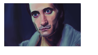
| Sherbert ice cream. See? It kinda works, right? A still from Nightcrawler. The reflective light from the computer screen was a little hard to render. I don't recall the source of that greenish light from the left. May have been from outside. Same with the warmth under the chin and neck. That could be the one rule where the shadow color is the complement to the light source. Or may be coming from another light source in the room - a bulb from above? |
 |
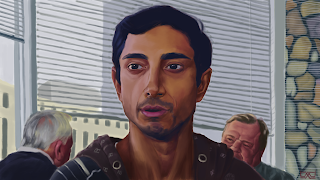
| He looks a lot more dignified here than in the actual scene. Here is where I kinda saw some peachiness in the transition from the lit side of his face (left) and the darker side (right) - around the forehead and right cheek. This and the one above were a little hard to nail down. One thing I must remember to do is simplify my values in the beginning. |


No comments:
Post a Comment